Tuesday, May 12, 2015

Evaluation of Project

EVALUATION 

I enjoyed this brief as I feel as if I've been able to freely work through my own processes and develop my experimentation with different materials. 

This project I feel has furthered my skills in illustration, as well as in research and development skills because of the amount of time we had for it and the amount of time I could use in making successful narrative illustrations. 

I had trouble keeping a time scale and plan of development and progress, this could be due to my own disorganization and having to balance other project deadlines along with this project deadline which I am unaccustomed to. 

I feel as if this project has pushed me in terms of thinking of how my process of development and final images could be improved and I feel more prepared for other projects, in which case this project has also helped me a great deal in having to work through difficult briefs. 

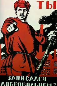
Over the course of this project, I have mainly focused my research on historical influences such as the Soviet propaganda and the Russian youth in regards to the Revolution. 

I did this because of the historical references of Animal Farm and because it's based on historical events and figures such as Josef Stalin and Karl Marx. 

My final images could have been better as could my development and time management, however I feel as if my final images were appropriate for what key events they were referencing within Animal Farm. 

Final Designs

FINAL DESIGNS


1. I tried to make this final design as powerful and grabbing as possible, I attempted to make the figures look empowering and I wanted this design to have a symmetrical element to it too, to show that Snowball and Napoleon were equals at this point of the book.

I gave Old Major a flag waving behind him to symbolize Communism, with the bright red colouring. 
I put the more minor animals below Snowball and Napoleon to show a disconnection with the beggining of their power struggle as a kind of foreshadowing.  

2. I drew out the seven commandments being written by Snowball instead of Napoleon or Squealer as I felt as if Snowball believed in them and needed them to be there. Above the board though, I decided to show the animals chasing Mr Jones out with his men as I felt as if the layout would work better like this, and in the top corner I put the farmhouse but had it in a black silhouette to show the irrelevance to it at this point in the book so that I could put it in one of the later on designs to show its increasing relevance as a symbol of the pigs greed. 

3. For this design I drew out the apples being eaten by Napoleon and Squealer, as well as a minor other pig for layout purposes, with the animals below them starving as another sort of foreshadowing of the animals eventual hunger. 

4. I wanted this design to be again more of a propaganda poster than anything else as I felt as if this would have more of a visual impact, I also decided to shadow in the humans faces and some of the minor animals faces to place emphasis on the pigs. 

5. For this design I decided to show the windmill before it was built to hint at its importance in the story as a metaphor for impossible dreams as well as the animals enslavement and oppression, with Snowball being chased by Napoleons dogs infront of it. 

6. For this design I drew out the trading produce to reference the beginning of the trade with the humans, but with Napoleon behind it as an imposing figure to ward off any hungry animals. 
7. This design was one of my most favoured, I drew out a pile of dead animals with Napoleon sitting on top of them and his dogs eating the corpses below. I put the beginning of the poem that Minimus put forward in place of 'Beasts of England' just for comedic effect. 

. 8. With this design I wanted to reference the Raised Fist symbol within lots of different propaganda across the world, I put the fists infront of the farmhouse to give a feel of 'angry mob' aesthetic. 

9. Because of my earlier drawings, I wanted to make this design a lot more subtle with what it was portraying, to reference the subliminal messages within Russian children's illustration books as well as to reference how the animals don't see Boxer die but they find out he is sent to a glue factory.

10. For this final I used one of my earlier designs because I felt it was the most fitting for this chapter and that it was a perfect and bold end to my illustrations. 

Book Research

After recieving the list of books to choose from for our narrative brief, I looked into the ones that interested me to see what the were ab

Treasure Island – Robert Louis Stevenson
- traditionally considered a coming of age story, noted for its atmosphere, characters and action, basically about pirates looking for treasure, it also influenced a lot of stereotypes for pirates such as x marks the spot.
http://en.wikipedia.org/wiki/Treasure_Island

The Princess Bride – William Goldman
- a fantasy romance novel, basically about a privelidged pretty girl mocking a poor boy, she realises he loves her, The story ends with a series of mishaps and the prince's men closing in, but the author indicates that he believes s'all good
http://en.wikipedia.org/wiki/The_Princess_Bride#Plot_summary

James and the Giant Peach – Roald Dahl
plot is pre much theres this orphan and his parents get killed in a storm so his aunts adopt him but they're awful and eventually he accidently grows this giant peach
'Originally titled James and the Giant Cherry, Dahl changed it to James and the Giant Peach because a peach is "prettier, bigger and squishier than a cherry'
Michael Simeon did british illustrations, been changed over years originally illustrated by nancy ekholm burkert, others redone by  Emma Chichester Clark, Lane Smith and Quentin Blake
http://en.wikipedia.org/wiki/Nancy_Ekholm_Burkert

The Big Book of Nonsense – Colin West
basically a book of weird poetry, illustrated by colin west too
http://www.amazon.co.uk/The-Big-Book-Nonsense-Poems/dp/0091768799
http://www.colinwest.com/

The Three Mulla-Mulgars – Walter de La Mare
based on three monkeys looking for their mother,
http://www.goodreads.com/book/show/4493667-the-three-mulla-mulgars
http://en.wikipedia.org/wiki/Dorothy_P._Lathrop

Street Art

MODERN PROPAGANDA

Graffiti development and Poster

Animal Farm shows what a power struggle and corruption among the people can do to a society and I wanted to show this with my designs somehow, which brought me onto looking at street art because of the current anti-establishment type street art coming from prominent and rebellious figures like Banksy, street art can be used as a freedom of speech as well as a kind of power to the people.

I did some background designs using spray paints for a smoke and brimstone effect for the background of my final images, however I tried using some of them for my final images and they didn't work well with the harsh colours and black outlines. 


Sources
Exit Through The Giftshop (2010) Banksy

Ormesby Hall images and drawings

ORMESBY HALL 


For drawing references I went to Ormesby Hall in Middlesbrough and drew from the old building. 

I wanted the design to be more farmhouse though than what it was so I made the designs more basic looking and tried to make them look ominous as I wanted to push the idea that this farmhouse was a man-made creation and that the animals didn't belong in there. 

I took away some of the windows and added a barn structure to the side of the building. 

I got the idea to use Ormesby Hall as a reference for my farmhouse as it tends to have sheep and horses at the front of it and has an imposing structure which is what I wanted my farmhouse to have too. 

Animals Images and Drawings

Own image
ANIMAL LIFE DRAWING

I also drew from some of the animals whilst I was at Ormesby Hall as it's surrounded by farms that you are able to walk around and the animals tend to be grazing outside. 

The day I went was really windy though and as I reside in Hartlepool, it's difficult to get there so I took more photographs than I did draw and used some of these photographs when drawing my animals. 

I found two horses that would be perfect for Boxer and Clover as the smaller one is feminine looking and the larger horse looks more like a workmans horse. 

I did some other more obscure drawings of the horses too but didn't like how they turned out as they looked too simple for what they were intended to be, which was surreal. 


Influenced propaganda and drawings

PROPAGANDA

Alexandr Rodchenko, Plakat
Alexandr Rodchenko

I looked at different books that were filled with old Russian Propaganda, the majority of which I really loved the visual concepts of like; Beat The Whites With The Red Wedge by El Lissitzky, 1919, and Have you volunteered for the Red Army? By Dmitry Moor, 1920 as well as a lot of Alexandr Rodchenko's work which I really liked because of the contrasting colours and sharp and aesthetically impacting aspects.


Dmitry Moor, Have You Enlisted in the Army?

El Lissitzky, Beat The Whites With The Red Wedge


Pacifiers, Aleksandr Rodchenko


My homage to Beat The Whites With The Red Wedge
I looked at Propaganda as a lot of it was open to interpretation to whoever viewed it and I want to make my designs like this too as I feel like Animal Farm is also open to interpretation as it's used by both right and left wing politics, right wing for the belief of freedom to succeed over equality as well as survival of the fittest, this shows with the pigs powerhold over the other animals and left wing for the belief of equality and what valuing success over equality will result in. 
http://idontgetpolitics.co.uk/right-left-wing


'there are only two classes: the capitalist class which possesses but does not produce and the working class which produces but does not possess'
- http://www.worldsocialism.org/spgb/socialist-standard/1980s/1986/no-986-october-1986/political-ideas-george-orwell

'Despite Orwell's influence political journalism is as corrupt as ever. However, if we, individually, question what we read and try to be honest and objective in what we write then it is a start. Above all it is important that our socialism is not compromised and that we do not put our trust in leaders but our confidence in the power of the working class.'
-http://www.worldsocialism.org/spgb/socialist-standard/1980s/1986/no-986-october-1986/political-ideas-george-orwell

Old Major

Old Major 

Sketch
For my Old Major design, I decided to draw out who he was based off, which was Karl Marx who is the original founder of Marxism, which is a similar belief to Communism.

George Orwell used Karl Marx for his Old Major creation as Marx created Marxism and this idea of an equality based society was one of the key starters of the Russian Revolution. 

For my Old Major design, I wanted to imply parts of Karl Marx within Old Major to make more of a point that it was Marx that Old Major was based from as Marx was a key player in the Russian Revolution. 
Character Development

Similarly, in Animal Farm, Old Major is basically the beginning of the rebellion when he gives his infamous speech to the animals and questions if they're truly happy in slavery to mankind. 

I decided to keep Marx' beard on Old Major and to use his crows feet to make Old Major look older as well as more like Marx. 


Design Idea

Napoleon

Napoleon images and drawings

Sketch
Sketch
Stalin Sketches
Character Development
I began the initial designs for Napoleon by first looking at who he was based off, which was Josef Stalin. 

I therefore tried out drawing Stalin to get an idea of what his head structure was like as I wanted to try and make human-like animals for my character designs.

I thought this would be a good way to characterise the animals and make them more interesting as well as push who they were and the historical influence of Animal Farm.


I then did some sketches of pigs so that I had the structure down so that I would be able to draw the pigs in my own style, and then moved onto making the pigs face morph into Stalin's, I tried different ways of doing this such as I began shaping Stalin's nose into a snout and I drew Napoleon from different viewpoints. 

I decided to add parts of Stalin's most prominent features like his moustache and brow line into my Napoleon design, as I wanted it to be obvious. 

Sketch

Snowball

Snowball images and drawings

Sketch

After deciding that I would be morphing the animals into who they were based off, I started the designs for Snowball, who in the story is Napoleon's 'political' competition and is based off Leon Trotsky, Stalin's political competition. 

Snowball is based off Leon Trotsky so I began by drawing some rough sketches of him and then doing the same as I did with Napoleon's character design. 

I used the most prominant features of Trotsky and morphed them with a pigs face, at first I didn't think of giving Snowball glasses and a moustache but I thought, as I had already given Napoleon his moustache, that it would make it more obvious as to who it was.


Character Development

Squealer

Squealer images and drawings


On my Squealer design I decided to look at who the character was based off and use this as reference for designing Squealer. 

I found that Squealer, who is Napoleons right hand pig, was based off Josef Stalin's protege Vyacheslav Molotov, who after the death of Vladimir Lenin, switched over to Stalin's side in the Communist Party and played a huge part in Stalin's 'Five Year Plan'.
http://spartacus-educational.com/RUSmolotov.htm

I looked at the most prominent features again with this design and used this to create a stylized design. I attempted a few different designs but finally decided on one and used it as reference for the presence of Squealer in my final images. 

Character Development of Squealer
Squealer Propaganda Design Idea

Why the Pigs?

WHY THE PIGS?


I decided that my main focus would be on what I thought of as the key characters in Animal Farm, which were the pigs. 

The pigs are the key authorative figures in the farm and are listened to and respected by the other animals. 

The other animals follow their orders as the pigs are the most 'intelligent' of the animals and this shows through the progression of the power struggle between Snowball and Napoleon and then onto Napoleon and the humans.

My own take on Animal Farm is that it's based around the power struggle of dictators and the consequences that the society recieves because of them, therefore I think this makes the pigs the most prominent and key characters which is why I wanted them to be more stylized than the other animals as I wanted them to stand out more.  


Sketches

Colour Choices

Lenin Is Alive, Artist unknown
http://imagecache2.allposters.com/IMAGES/BUY/0-587-03061-5-M.jpg
I went with warm but sharp colours for my designs as warm colours are generally more exaggerated and they stand out more which is what I aimed my designs to do. 

With a lot of the Propaganda posters I've looked at, in relation to the Russian Revolution, artists tend to use more bright vivid colours in their designs to stand out to the public, with warm colours too this helped in rilling up the masses for believing in what they were viewing which helped bring about the revolution, as without the people, revolution and change can't happen. 

Friendship Forever, 1956
http://watermarked.heritage-images.com/2599336.jpg


With my designs for Animal Farm, I wanted to imply a childishness with it as generally books with animals as their characters tend to be aimed at children and after looking at Stories For Little Comrades: Revolutionary Artists and the Making of Early Soviet Children's Books by Evgeny Steiner, which explains how after Stalin brought a censorship of art, artists focused in on children's book illustration as children were the most impressionable which was perfect for the molding of a new kind of person with a solid belief in equality. 
http://globalpropaganda.com/articles/TranslatingColours.pdf
Dmitry Moor, Have You Enlisted in the Army?
http://www.artnewsnviews.com/userfiles/image/mar2012/29asen/asen2.jpg

'In the Soviet Union of the 1920s, the most prominent avant-garde artists were eager children’s book illustrators. Reaching a mass audience of unformed, malleable young people appealed to their commitment to an art manifesto based on the creation of a new kind of person for the revolutionary age. At the same time, the opportunity to work for good pay along with a low risk of censorship were practical attractions.' 
-Stories For Little Comrades: Revolutionary Artists and the Making of Early Soviety Children's Books by Evgeny Steiner.

As children tend to be more attracted to bright and loud colours, I wanted to utilize this in my work and have tried working with bright reds, oranges, yellows, blacks and whites to attempt to create loud and expressive designs.

My main colour that I wanted to push with my designs was red, as it is generally synonymous with communism and the colour has been used to symbolize rebellion for many years. 

During the Russian Revolution, the communists flew a red flag with a yellow hammer and sickle on it and it was thought to symbolize the blood of the proletariat, the working class, which was shed in their involvment of the revolution.
http://classroom.synonym.com/red-communism-mean-9156.html
Lenin Propaganda, Artist Unknown
https://blogger.googleusercontent.com/img/b/R29vZ2xl/AVvXsEgOPWD2jSyATfi9iSxM-bpOxFDa-xO54g84o8qEcp64iz7salQ-0i8loDRWsQ0sT16SocINyLpnCuMzKs4zLcBSbOxLquXgUlWncXJ7THl7Lb2PF3RQ1p4Fyi5RJmO_plbcsooesNYeCNQ0/
/russian-revolution-october-1917-vladimir-ilyich-lenin-ulyanov-1870-1924-russian-revolutionary-anonymous.jpg

Target Audience

Shepard Fairey, Animal Farm
 http://obeygiant.com/images/2008/12/poster_animalfarm_lrg.jpg

TARGET AUDIENCE


The original Animal Farm that I purchased for this brief had the front cover design by Shepard Fairey, it has a really strong propaganda/revolutionary design to it with simple shapes within and it stands out well against other copies of this book. 

Shepard Fairey, 1984
http://obeygiant.com/images/2008/12/poster_1984_lrg.jpg
I decided as the design by Shepard Fairey caught my eye and was admired by my peers, that this shows that loud but simple designs are effective with a young adult audience with an interest in art and with the current disillusionment and disinterest of politics within my generation and the stereotypical interest in rebellion and revolution, my target audience should then be young artistic adults, possibly my peers and people I know. 

I did originally attempt to make my designs more childlike and had the target audience of children in mind, but then after realizing the book was too controversial and adult in content, I decided to go for an older target audience that could understand the images but still decided to keep with my colour scheme which was originally meant to be effective for children but I think I could be able to work around it to make it effective for adults too. 

Ralph Steadman's Animal Farm

Ralph Steadman
http://beautifuldecay.com/wp-content/uploads
/2014/04/steadmanillustration16.jpg

RALPH STEADMAN


I found another illustrated Animal Farm by Ralph Steadman, his designs are incredibly effective in telling the story with minimal colour but prominent black outlines. 

Steadman will be one of the many illustrators at the Illustration Festival, his designs really helped me understand the brief better and how I would be able to go about doing it. 

He has an interesting way of making the animals look morbid and sickly, which works well with the book's content. 


Ralph Steadman
http://designwithspine.files.wordpress.com/2011/10/boxer_color.jpg

Ralph Steadman
https://s-media-cache-ak0.pinimg.com/originals/3c/ac/e3/3cace3fa41df0881c94dce152d359bb7.jpg


Choice of Materials

MATERIAL CHOICES

On beginning my Animal Farm narrative illustrations, I tried a variety of different materials and techniques in my design ideas but eventually decided to use watercolour pens, fine liners, as well as some white fine liners and brusho paint effects within my backgrounds. 

I used block colours and bold designs for the main parts of my designs and then used a more faded background so that the main parts of the designs would stand out above the background better. 


I tried using ProMarkers but stopped after realizing how much they bleed through paper and they looked too messy and were too difficult to contain within black outlines which is one of the key techniques I wanted my designs to have.


The Propaganda block effect of the pens is why I chose to use them, I had some difficulties in shading with them at first but then realized quick fluid motions made them work more like brushes than pens and utilized this in my work.

Thumbnails

The key events in Animal Farm that I chose to illustrate for my final pieces were quite easy to pick as the book only has ten chapters and within each chapter, the events that took place were key to the development of the story and all had individual references to the historical content of the Russian Revolution. 

Key Events in Animal Farm

1. Old Major's speech after Mr Jones falls asleep drunk - his speech is a reference to Karl Marx's communist manifesto. 
https://www.marxists.org/archive/marx/works/1848/communist-manifesto/

2. Old Major dies and Animalism is formed in secret, the animals begin to starve and run Mr Jones out of the farm, the seven commandments of Animalism are written.

3. The pigs health is the most important, they reserve the apples and milk for themselves though the animals begin to work in harmony, some of the animals also learn to read and write.

4. The farmers of the neighbouring farms begin to fear Animal Farm, they attack the farm and the Battle of Cowshed happens, the animals win. 

5. Sheeps begin bleating 'Four legs good, Two legs bad.' The windmill idea is introduced by Snowball however Napoleon doesn't like it and Snowball is exiled. 

6. The windmill is built afterall and the pigs begin trading with humans. 

7. Napoleon orders the execution of the animals he suspects are working with Snowball and the song of the rebellion 'Beasts of England' is banned by Napoleon.

8. The other farmers decide to attack the farm and tear the windmill down before being ran out by the animals. 

9. Boxer breaks his ankle and is sent to the glue factory to be killed. 

10. The pigs are now indistuingishable to the humans and possess whips, the seven commandments have all been changed to suit the pigs needs and to oppress the other animals in a way that is unchallengable. 

I tried to push these key events in my thumbnails by layouting them so that they could include the key events altogether. I wanted to make them more surreal in their way of telling the story. 

Symbols

SYMBOLS & THEIR ORIGINS

Carrie Worthen, Wisconsin AFL-CIO
http://www.docspopuli.org/articles/Fist_images/fist-wisconsin1.jpg

Raised Fist Symbol
Socialist Party of Malaysia,
http://www.docspopuli.org/articles/Fist_images/PSMfist.jpg

Oakland General Strike, 1926
http://www.docspopuli.org/images/OWS-2011/OccOak-fist3.jpg
The Raised Fist has been used throughout historical revolutions as a symbol of unity and resistance, it has been used in different countries such as Cuba and Serbia within their rebellious propaganda posters. 

It's a strong and empowering symbol that brings the oppressed together. 
http://www.docspopuli.org/articles/Fist.html

Hammer & Sickle, Communist symbol
http://upload.wikimedia.org/wikipedia/commons/thumb/7/7e/
Hammer_and_sickle.svg/1024px-Hammer_and_sickle.svg.png

Communist Hammer & Sickle


This symbol was created during the Russian Revolution to be used by the Communists, the hammer is a symbol of the working class and the sickle is a symbol for the peasantry. The hammer and sickle represents the alliance between the two and the revolution that their alliance can create. 
http://rbth.co.uk/arts/2014/07/19/serp_i_molot_38327.html


Animal Farm Symbol Design 

Own Design

I created a symbol to reference the infamous hammer & sickle design but instead of the hammer, I used a horseshoe to symbolise the working class in reference to Boxer as he was known for his hard work. 

I drew out a pig trotter and shaped it so that it could be placed between the horseshoe instead of having a circular section cut out from the horseshoe. 

I wanted to symbolize the pigs oppressing the working animals by dipping their trotter in the produce and taking the profits for themselves on the backs of working animals. 

Friday, May 1, 2015

Animal Farm Research

Animal Farm

by George Orwell

'Mr Jones of Manor Farm is so lazy and drunken that one day he forgets to feed his livestock. The ensuing rebellion under the leadership of the pigs Napoleon and Snowball leads to the animals taking over the farm. Vowing to eliminate the terrible inequities of the farmyard, the renamed Animal Farm is organized to benefit all who walk on four legs. But as time passes, the ideals of the rebellion are corrupted, then forgotten. And something new and unexpected emerges...' 
-Blurb of Animal Farm by George Orwell

Animal Farm was based around a kind of satire of the Soviet Union, Orwell's characters are based on members of this party. For example, Napoleon the pig is based on Josef Stalin, Snowball was based on Leon Trotksy and Old Major on Karl Marx. A lot of the book takes key parts of the Russian Revolution and simplifies them into events throughout the book. 
http://www.k-1.com/Orwell/site/work/summaries/animf.html


THE BRIEF

My goal for this project is to show fully developed and professional illustrations through research on my chosen book and different techniques and materials. I will do this by creating design sheets, thumbnails, medium exploration, peer and audience feedback and will show any design changes that were required for fully realized illustrations.  

WHAT I NEED;
SKETCHBOOKS 
WORK SHEETS
THUMBNAILS
DESIGN SHEETS
FULL RESEARCH DOCUMENTATION
TEN FINISHED ILLUSTRATIONS 
BOOK COVER


SHEPARD FAIREY

Shepard Fairey, Obey logo

 Shepard Fairey is a well known illustrator based in America, he's done many different medias within art such as Graphic Design and contemporary street art. He's most well known for his project 'Andre the Giant Has a Posse' which was a street art campaign in which he worked with pictures from the Weekly World News, which included the picture of Andre the Giant, and created a stencil out of them which became well known in the skating community and began getting tagged everywhere.
http://www.interviewmagazine.com/art/shepard-fairey#_
His designs for George Orwell's books, Animal Farm and 1984 caught my eye when I was looking for Animal Farm, the colours are in the style of the Russian Revolution propaganda posters I found which works well with what Animal Farm is based upon.